
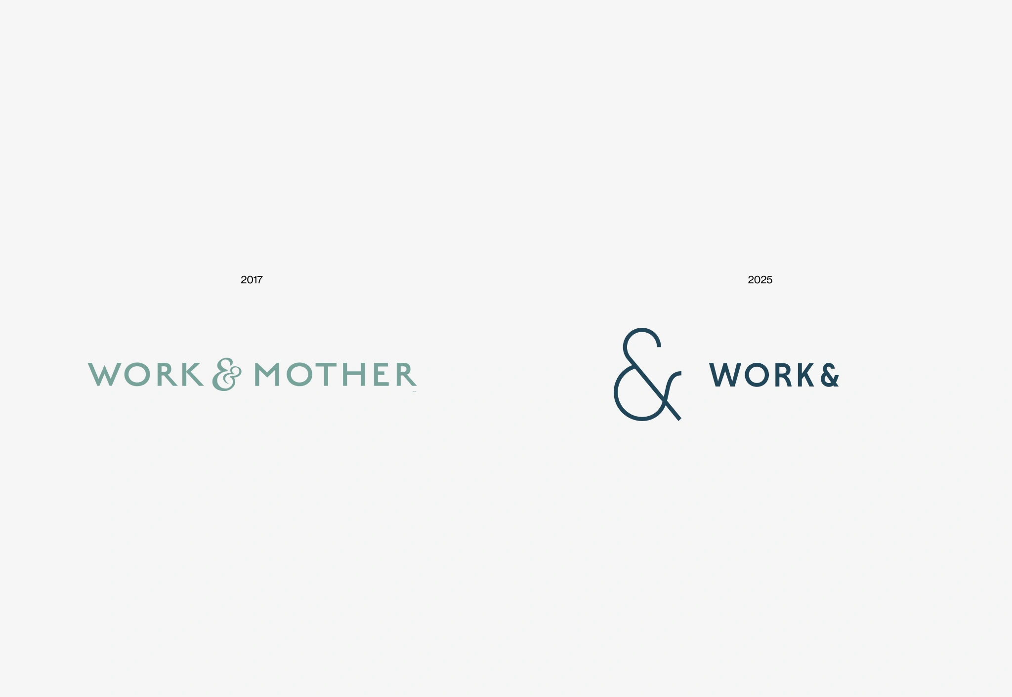
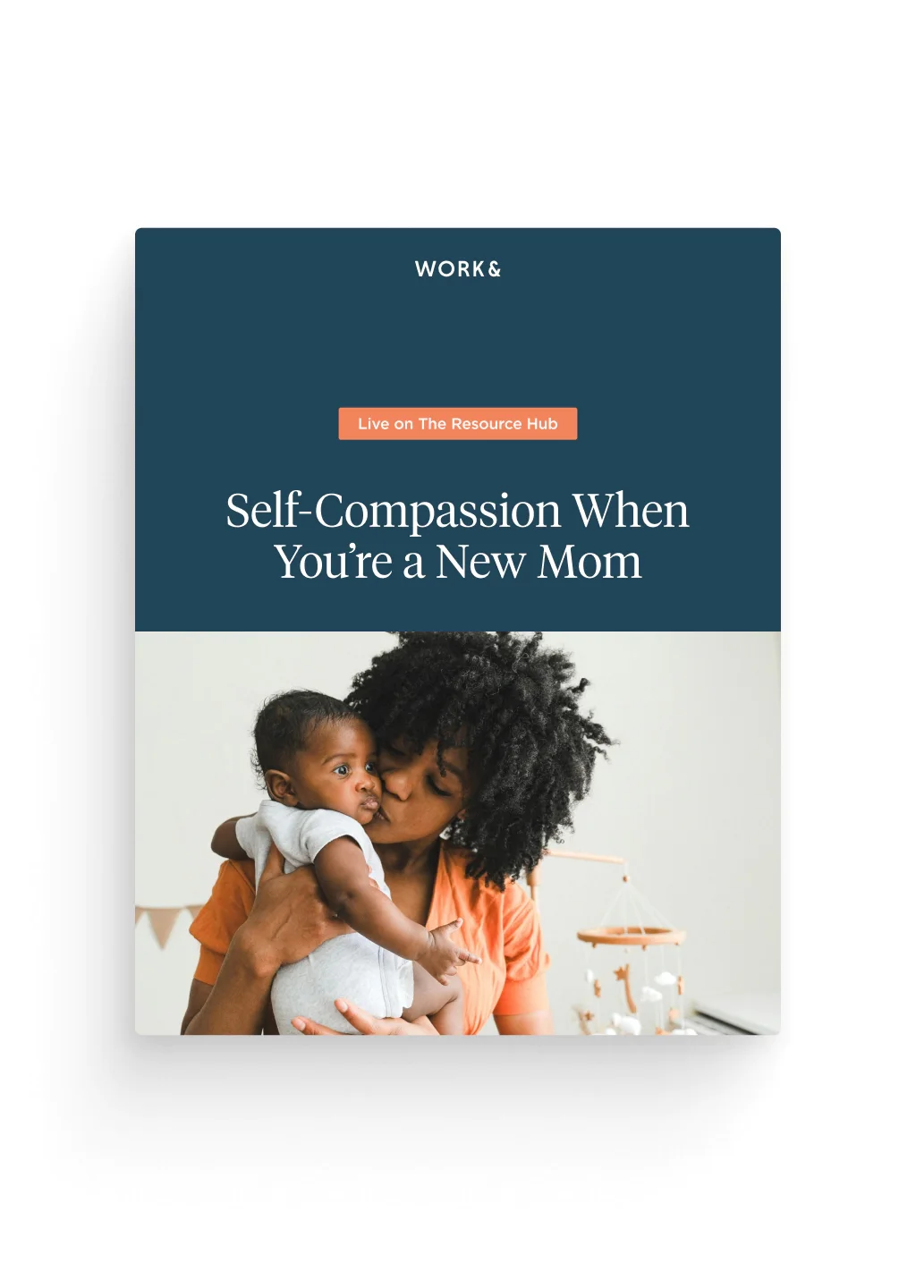
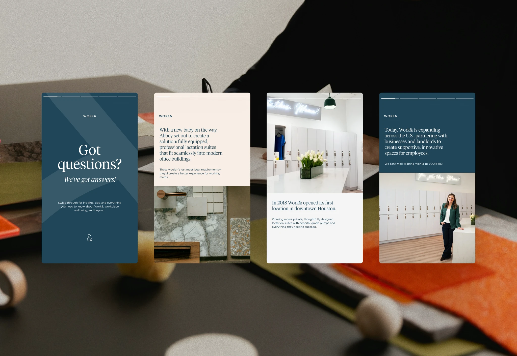
Work& (formerly Work & Mother) had proven the business case for professional lactation suites but was ready to expand beyond nursing mothers into broader workplace wellness. The challenge was rebranding without alienating their existing customer base while appealing to landlords, corporate clients, and a wider employee demographic. They needed an identity that could maintain the warmth and empathy of the original Work & Mother while establishing credibility in the larger B2B wellness market. My role as Creative Director was to help guide that shift, leading a full rebrand across strategy, naming, design, and execution.
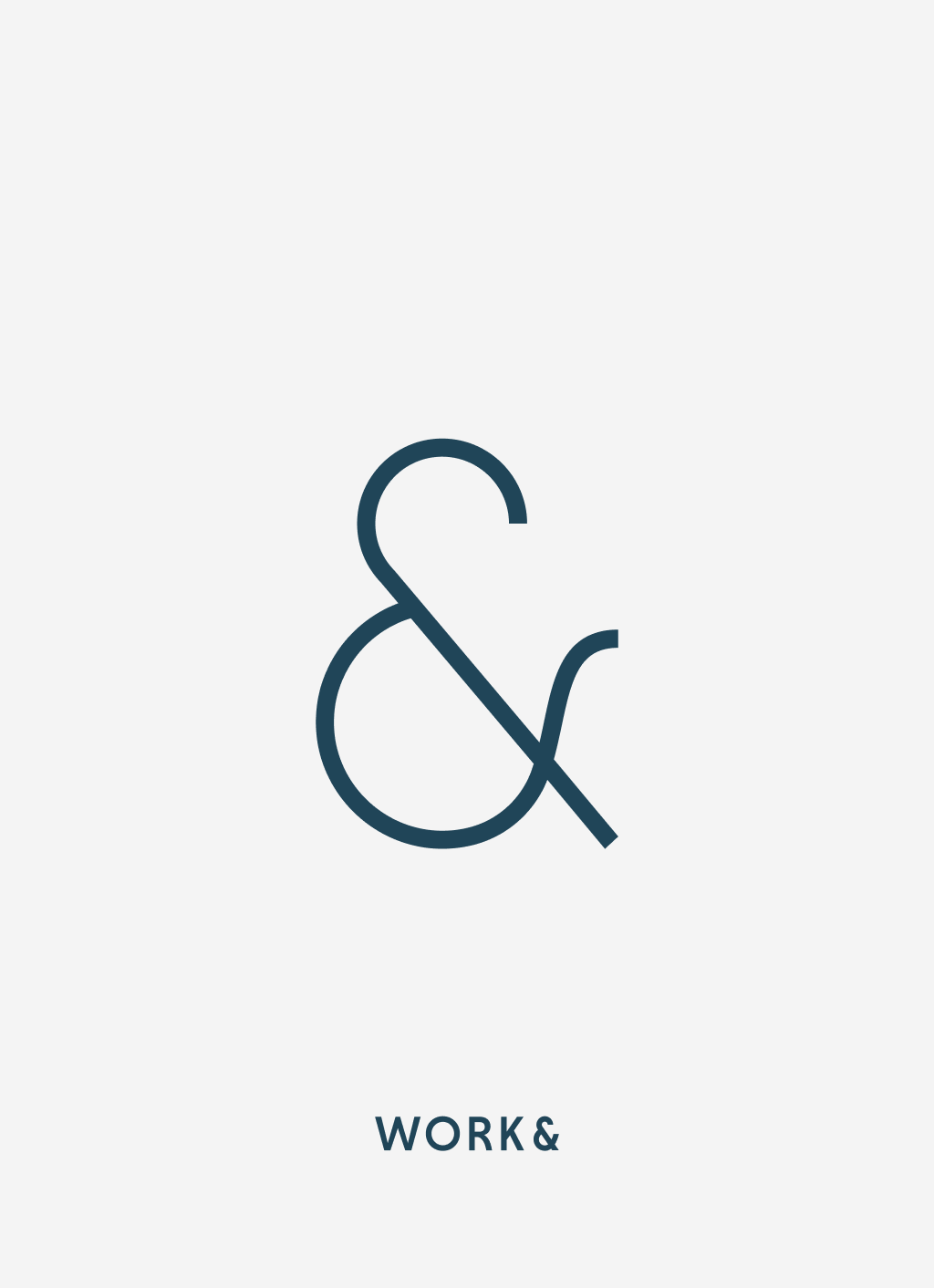
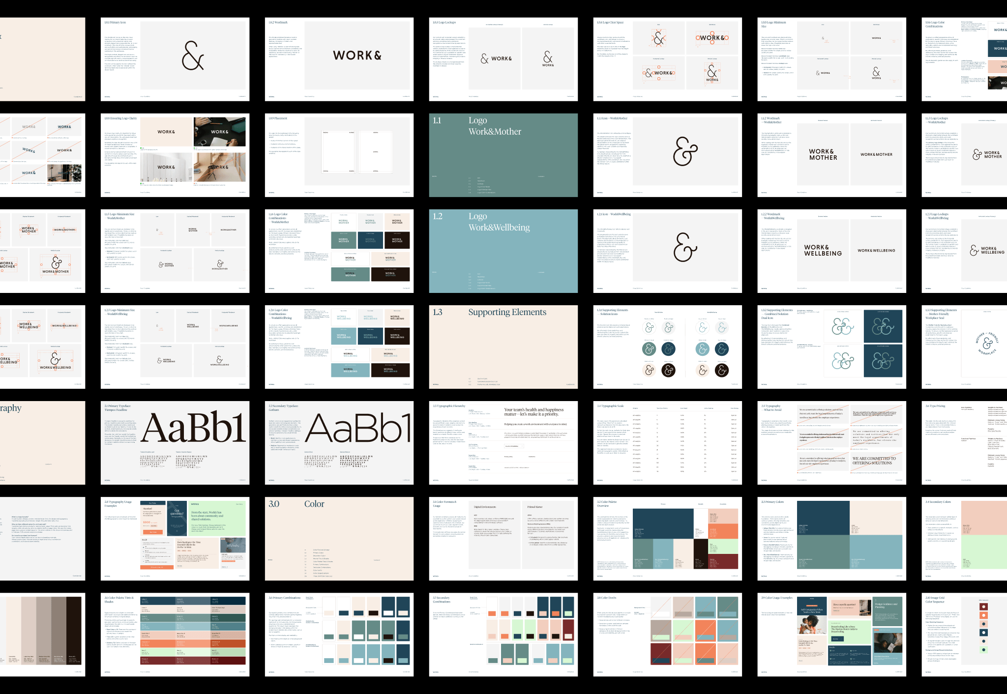
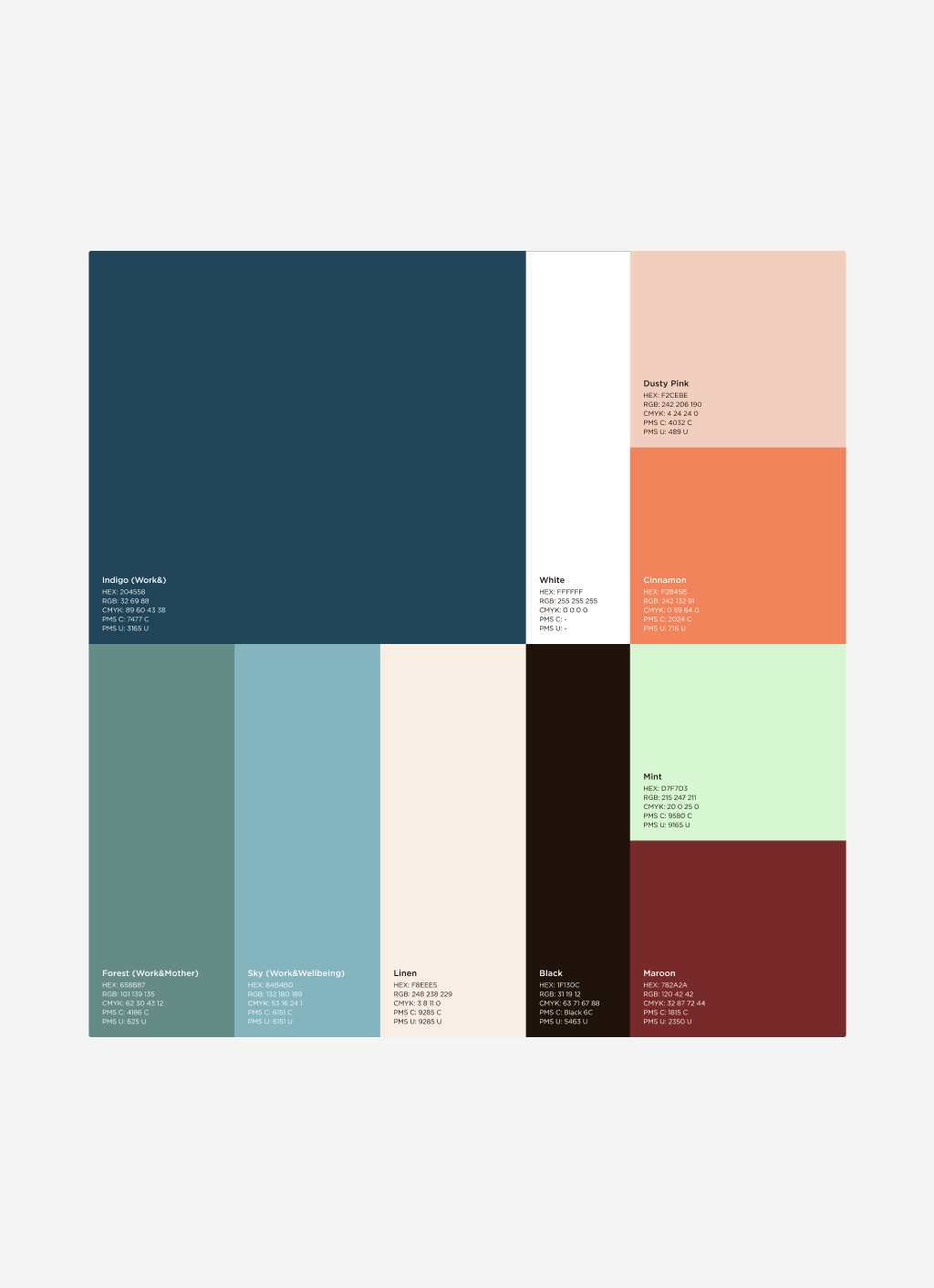
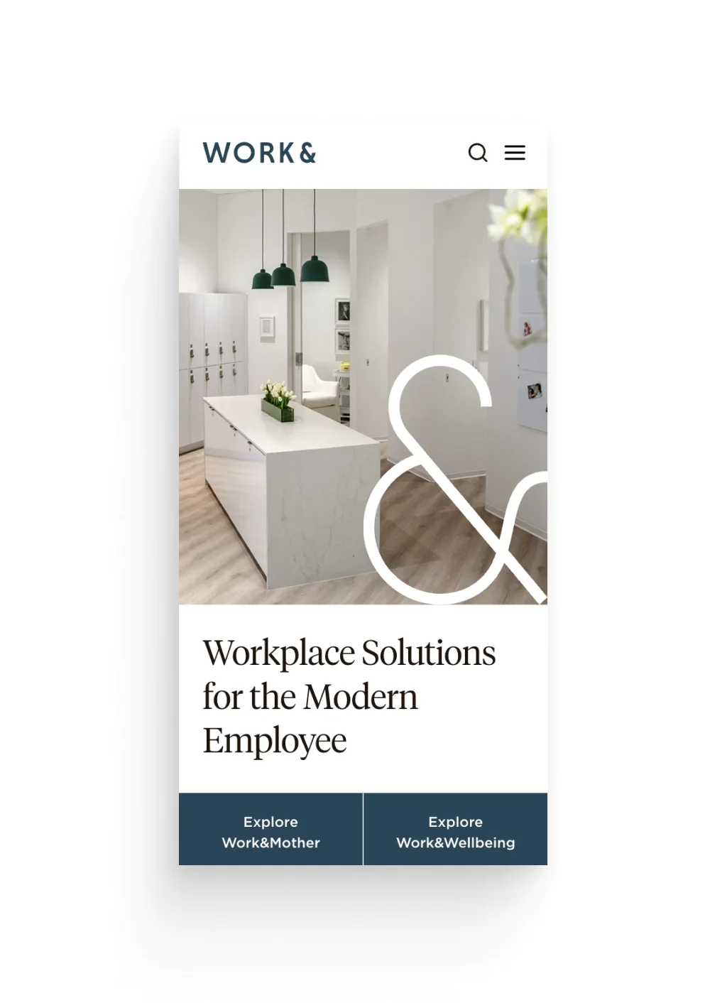
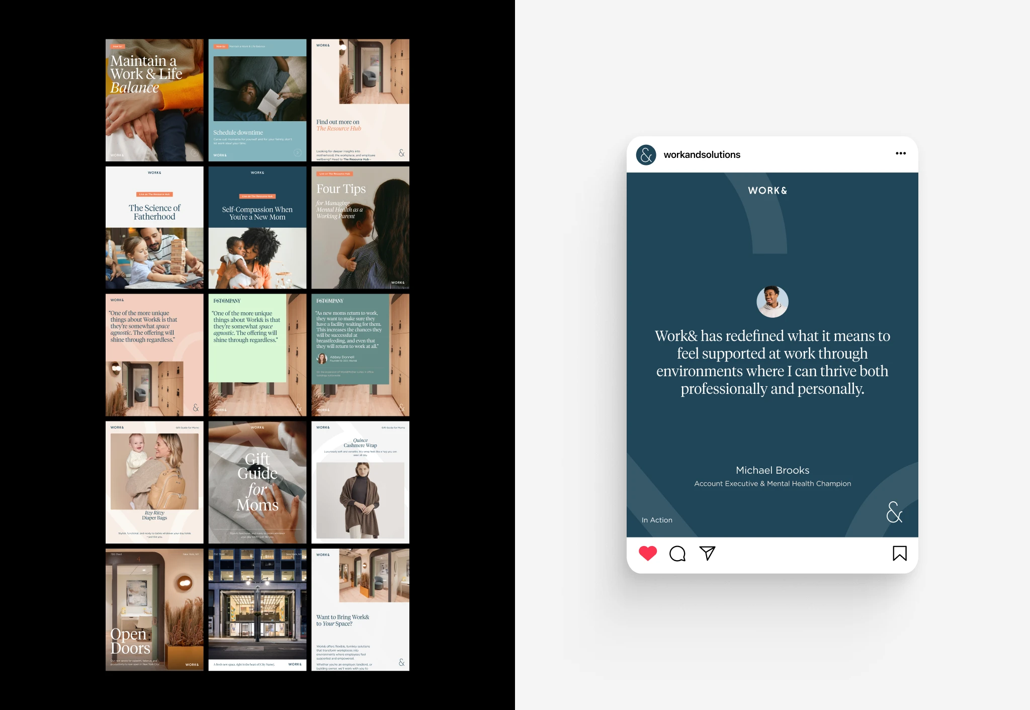
We built the rebrand around their most recognizable asset: the ampersand. Instead of abandoning what worked, we evolved it—stripping away flourishes that felt too maternal and finding elegance through clean, thin sans serif strokes. The naming strategy was deliberately simple: Work& as the parent brand, with Work&Mother and Work&Wellbeing as distinct service lines. Each service got its own ampersand mark that evolved from the parent brand identity, creating visual coherence across the expanded portfolio.


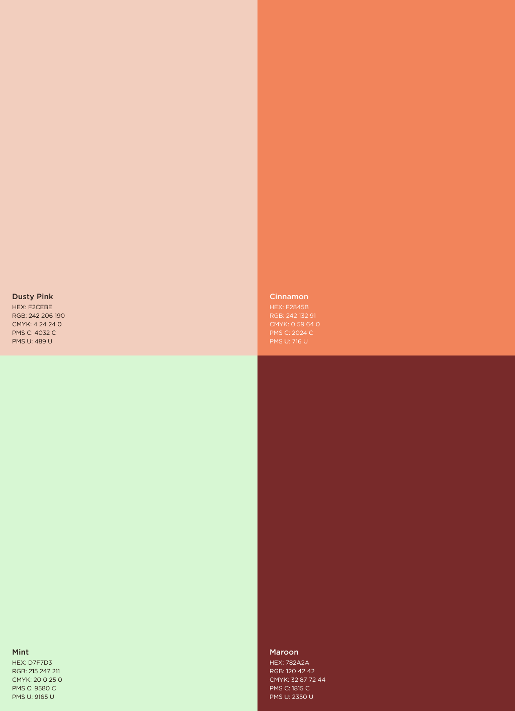
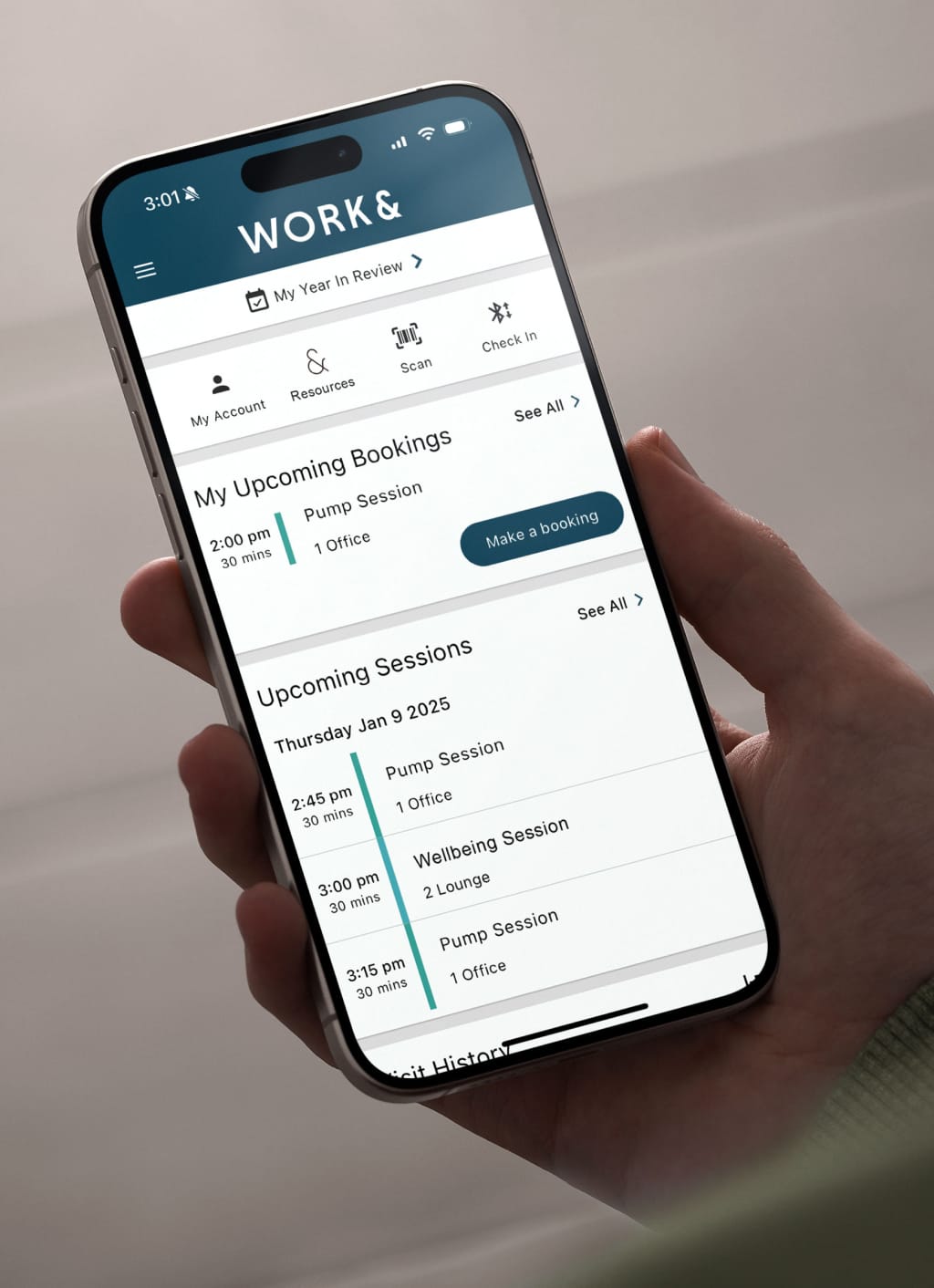
The refreshed color palette strikes a balance between function and flexibility—grounded enough for serious use, but still vibrant and approachable. Indigo for Work& establishes gravitas and authority, Forest for Work&Mother maintains continuity with their original green, and Sky for Work&Wellbeing suggested openness and clarity. We redesigned their website to speak equally well to real estate partners evaluating ROI and employees seeking wellness support.

The rebrand launched with immediate business impact: their first Work&Wellbeing suite registered 58 members from 24 companies within a month, proving that the expanded positioning could drive real adoption beyond their core lactation services.
credits
AgencyAct Second
RoleDesign Director
DesignersDani Herrera, Andrea Pacheco
Web DevelopmentJoey Cupelli
Strategy & CopywritingDaniel Batelle
Project ManagementLucy McCarthy