Wine Chips launched with ambitious positioning: put the couture in potato chips. Founder Jonathan Strietzel had prototypes that generated massive lines at LA Winefest, proving demand for specialty snacks that could sit credibly next to wine and charcuterie. But they needed an identity that felt approachable enough for mainstream appeal while sophisticated enough for specialty wine shops—a tricky balance in a category dominated by either mass-market junk food or precious artisanal products.
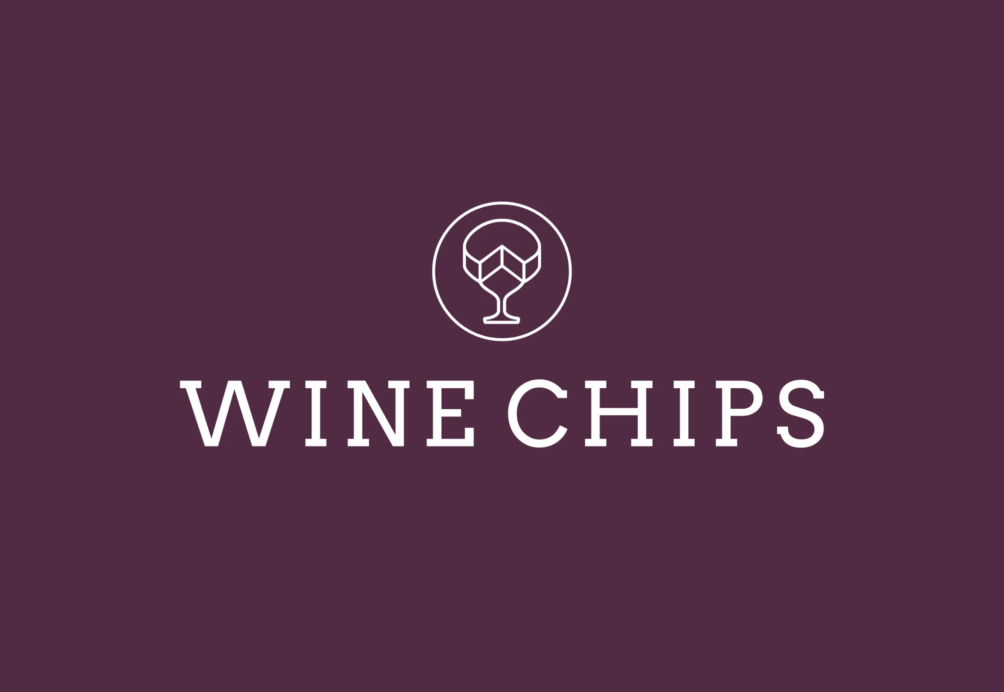
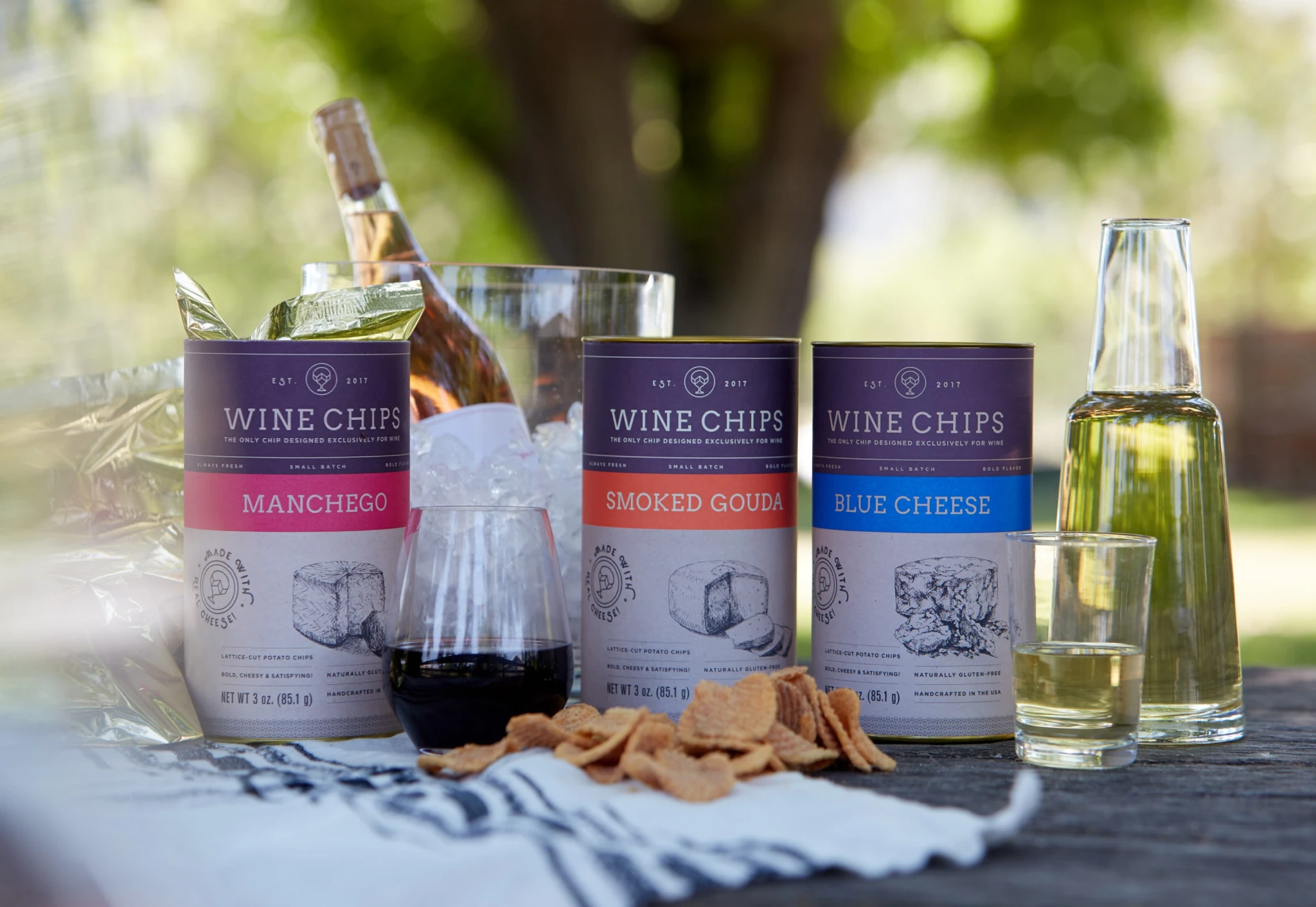
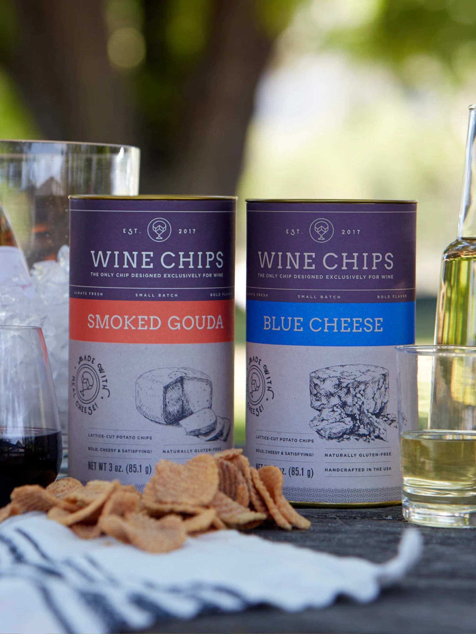
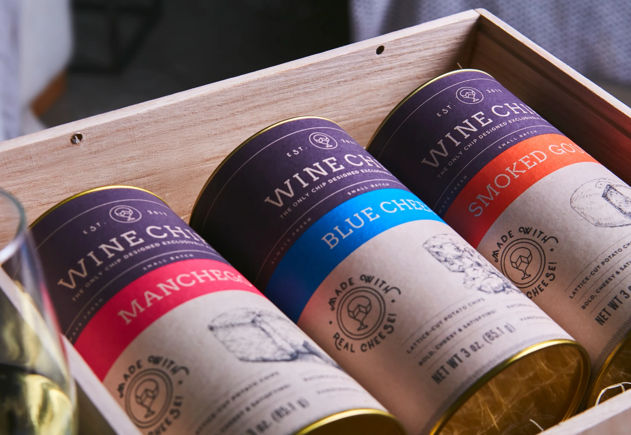
We built a visual system around bold confidence and flavor intuition. The color approach was deliberately straightforward—blue cheese got blue, smoked gouda got warm amber—but everything had to harmonize with the brand's hero deep purple-red. Typography stayed unapologetically big: huge headlines paired with substantial copy columns because if you're going to interrupt someone's wine moment, you better have something interesting to say.
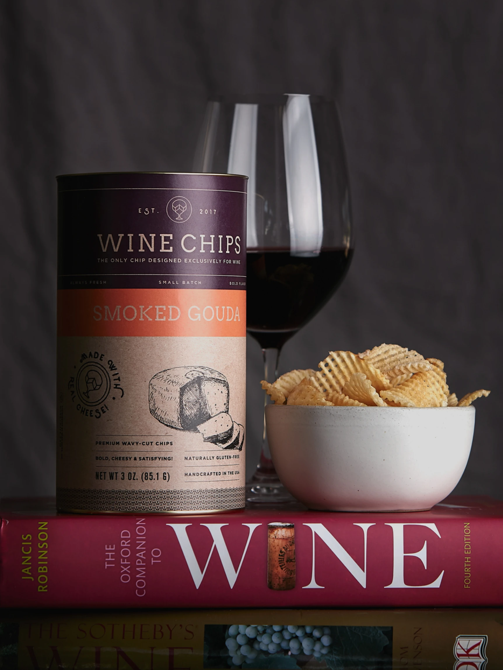


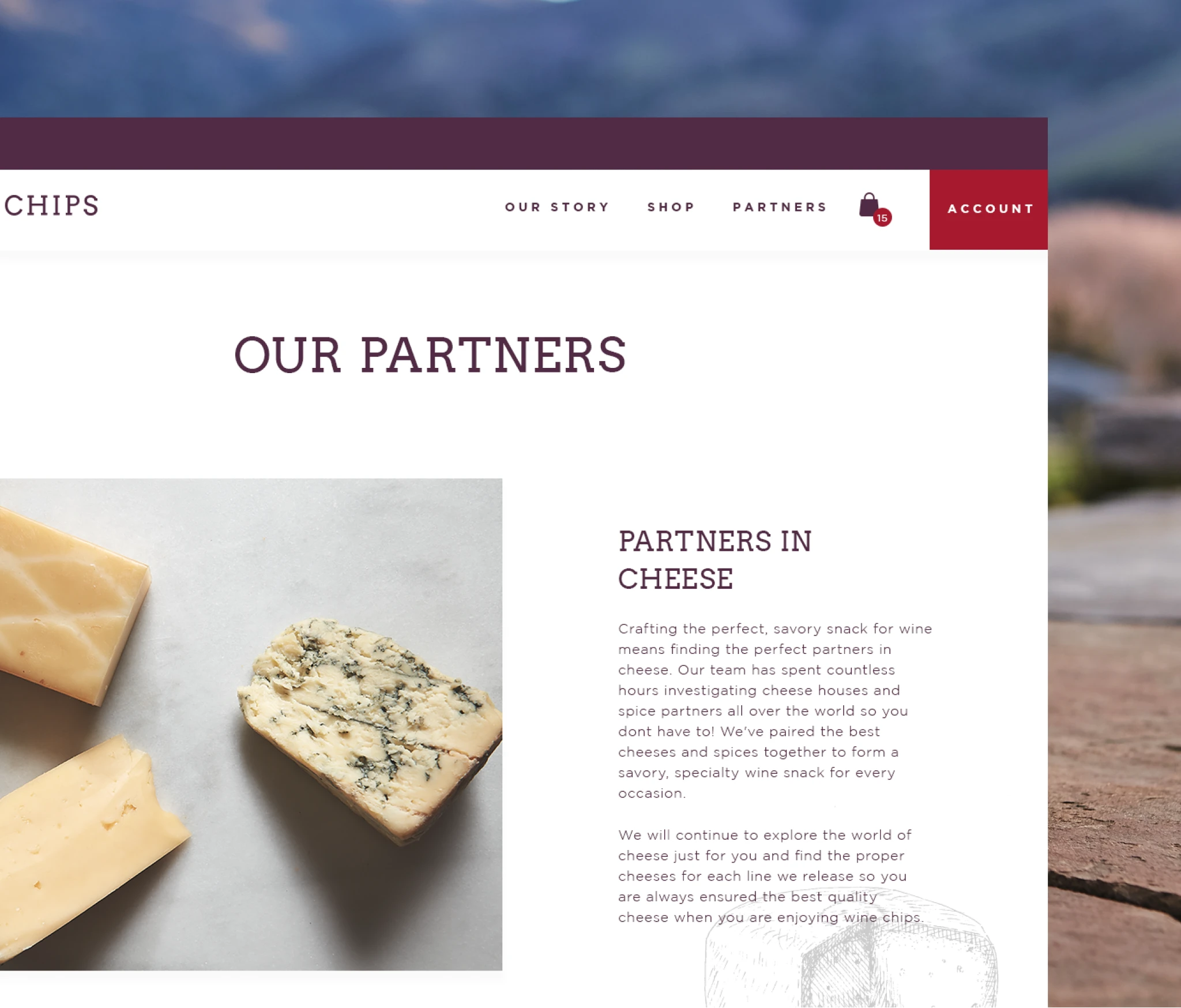
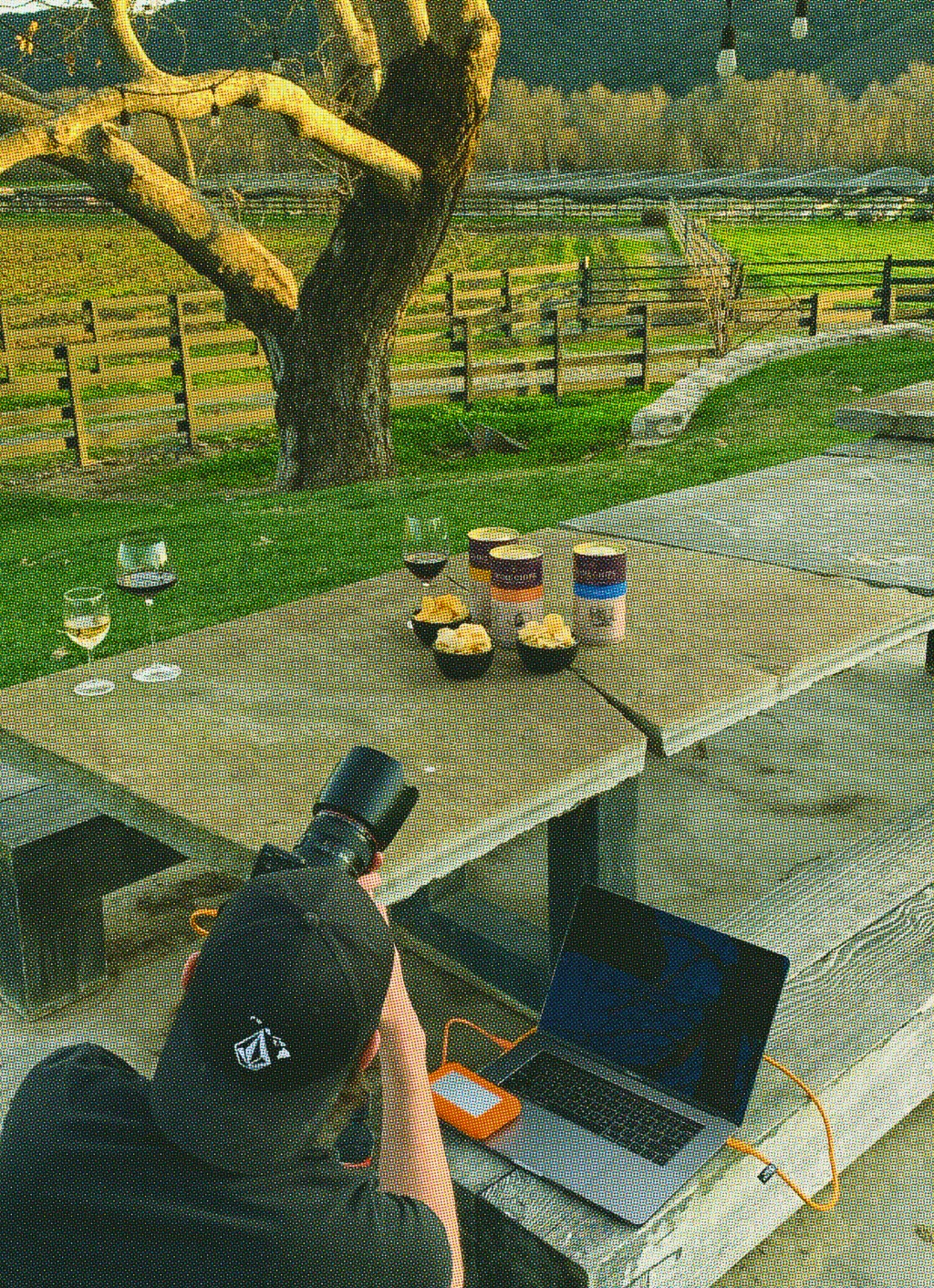
The packaging itself made a statement: instead of flimsy chip bags, we developed a substantial tube format that borrowed gravitas from premium spirits packaging—the kind of container that signals quality before you even read the label. The tone walked the line between playful and sharp—smart enough for sommeliers, accessible enough for Williams-Sonoma.


Working directly with packaging vendors, illustrators, copywriters, and the founder, we launched a brand that could scale from farmer's markets to 650+ stores in year one. The scrappy energy became part of the charm: testing formats, styling our own shoots, iterating fast. Wine Chips hit over $1 million in online orders, launched a Private Reserve subscription service, and proved that specialty snacks could build real businesses when the branding doesn't overthink the obvious.
credits
AgencyNEWCo Branding
RoleDesign Director
Chief Creative OfficerSara Rotman
PhotographerBrian Bins
IllustratorEric Fabbro