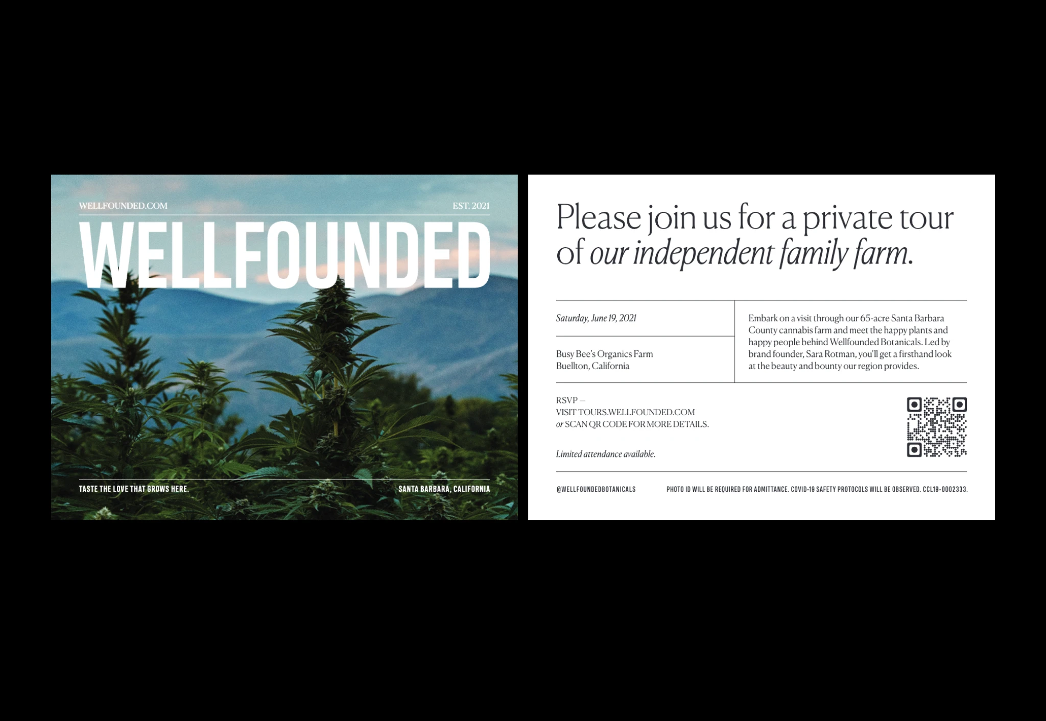
Wellfounded Botanicals needed to launch cannabis-based self-care products in California's crowded legal market. Founded by Sara Rotman after her own healing journey with serious illness, the brand emerged from a working farm in Santa Barbara with formulations that actually worked—but the category lacked any sophisticated visual language. The challenge was making luxury skincare sensibilities work in cannabis while honoring the founder's personal story and the farm's authentic origins.
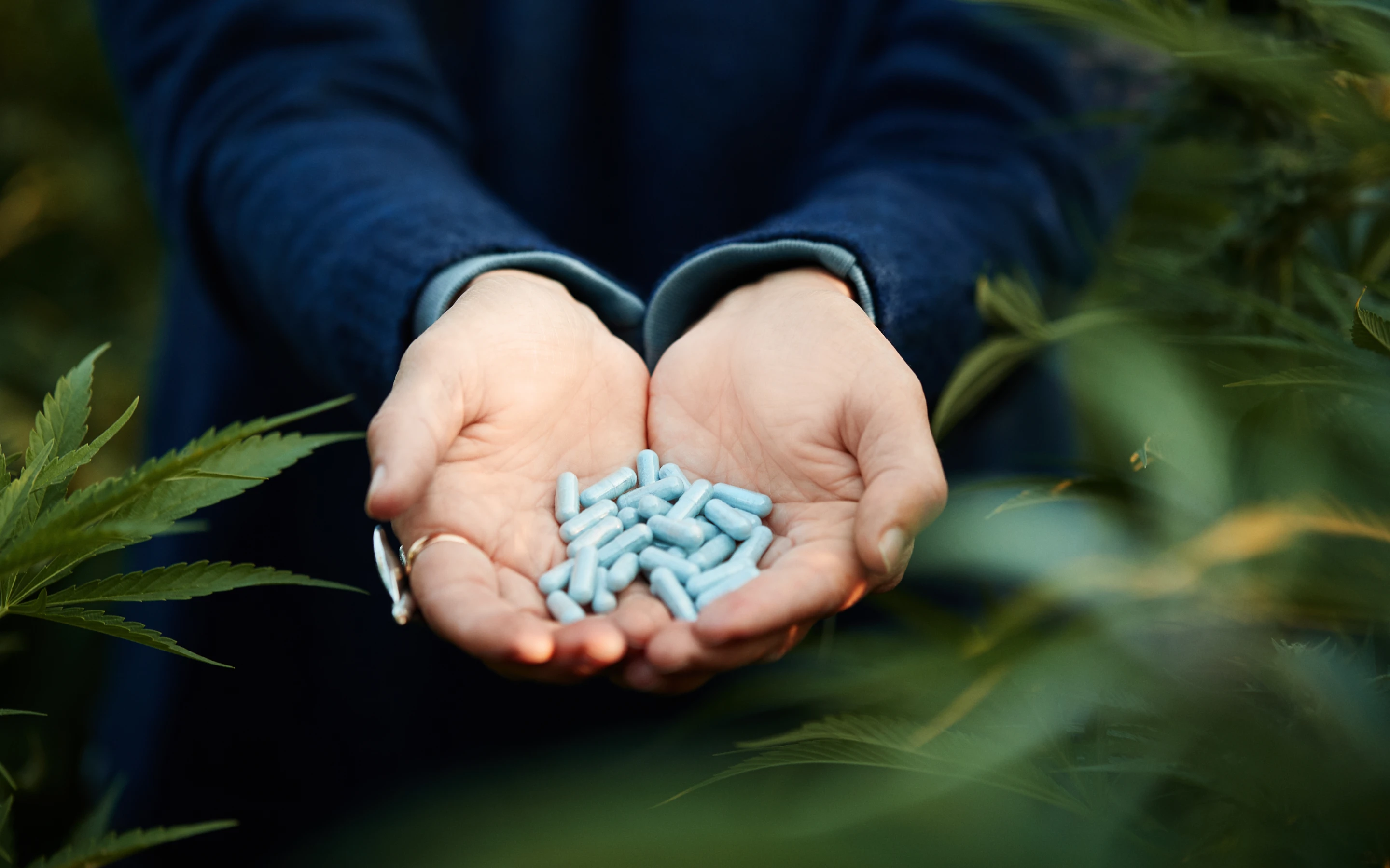
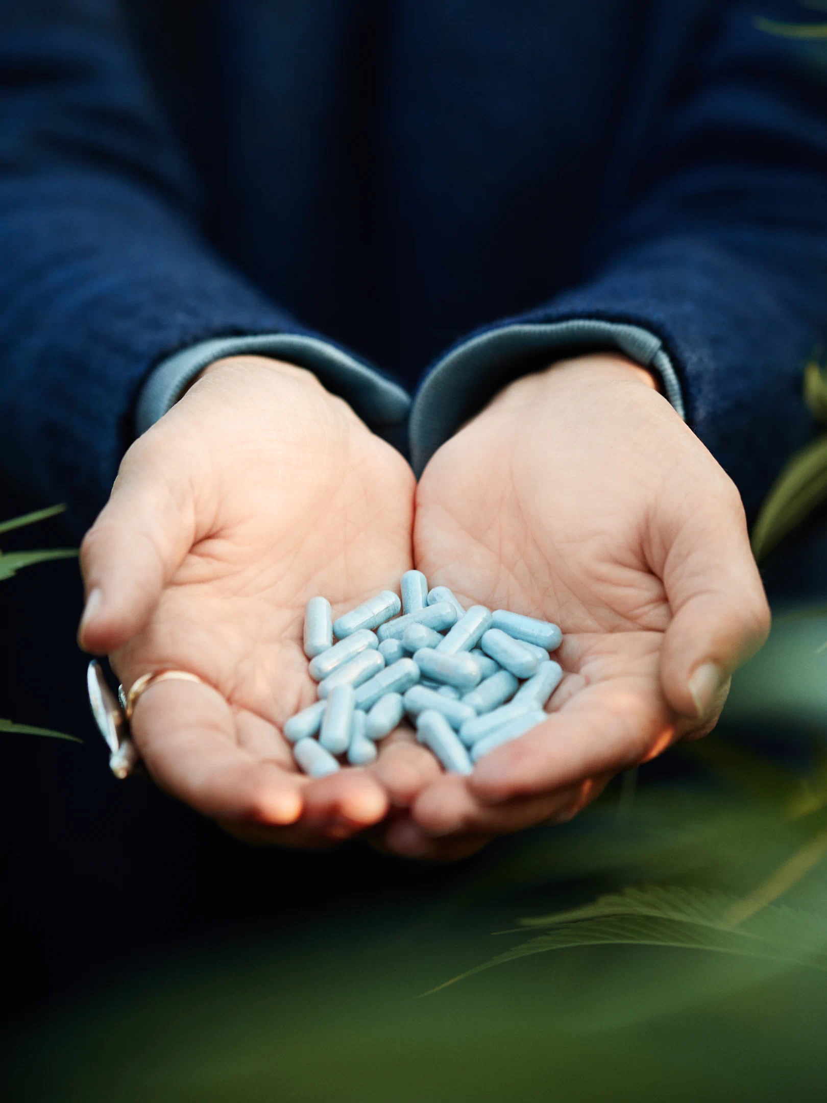
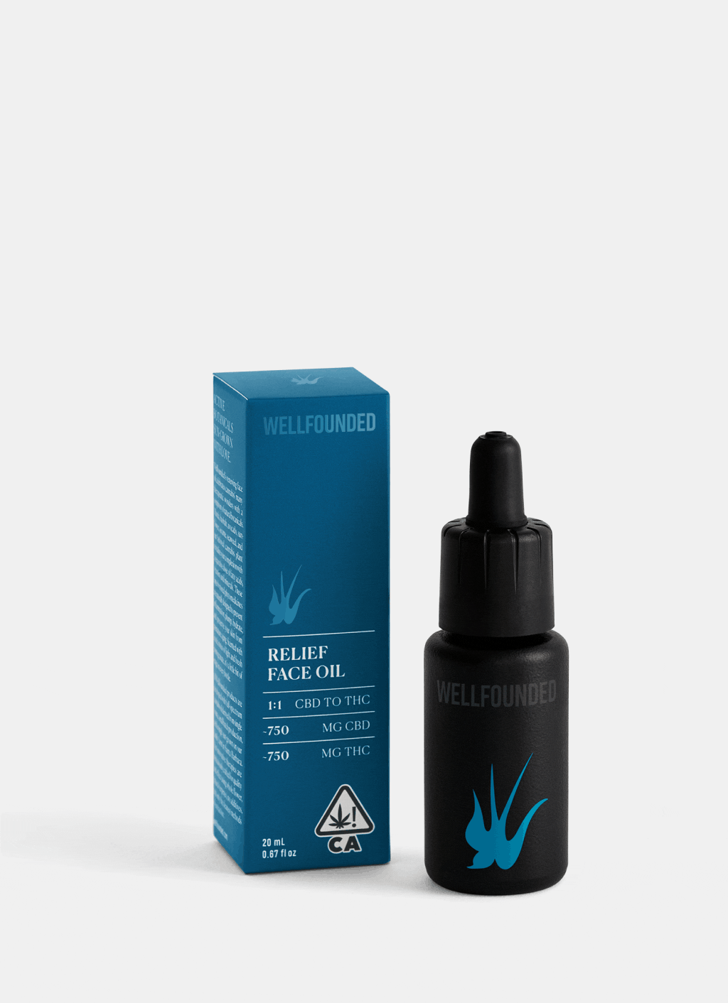
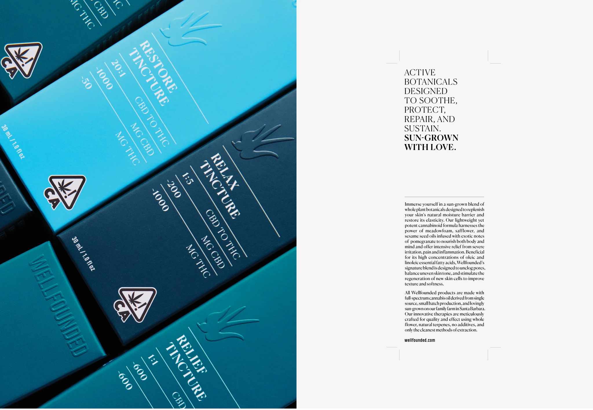
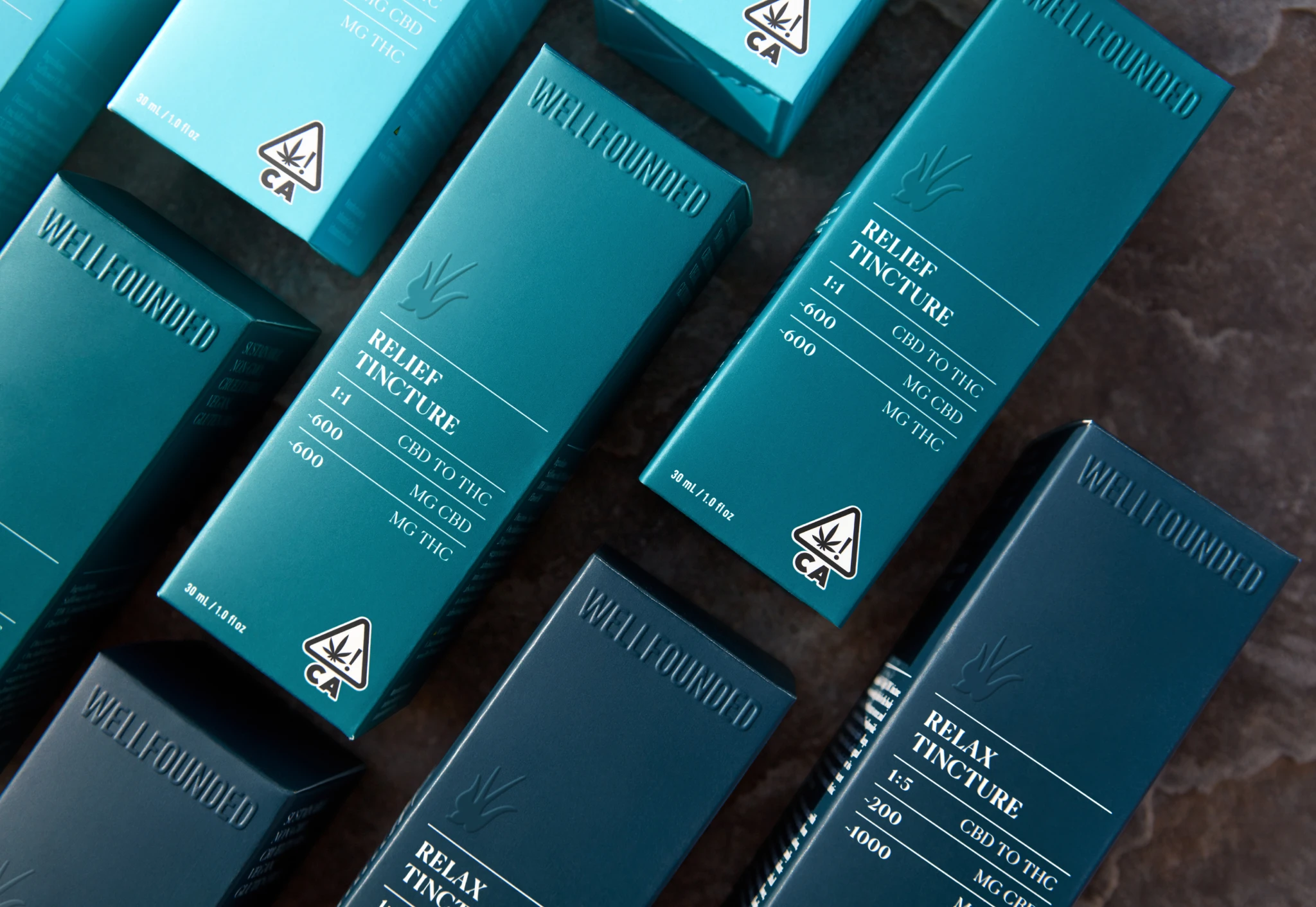
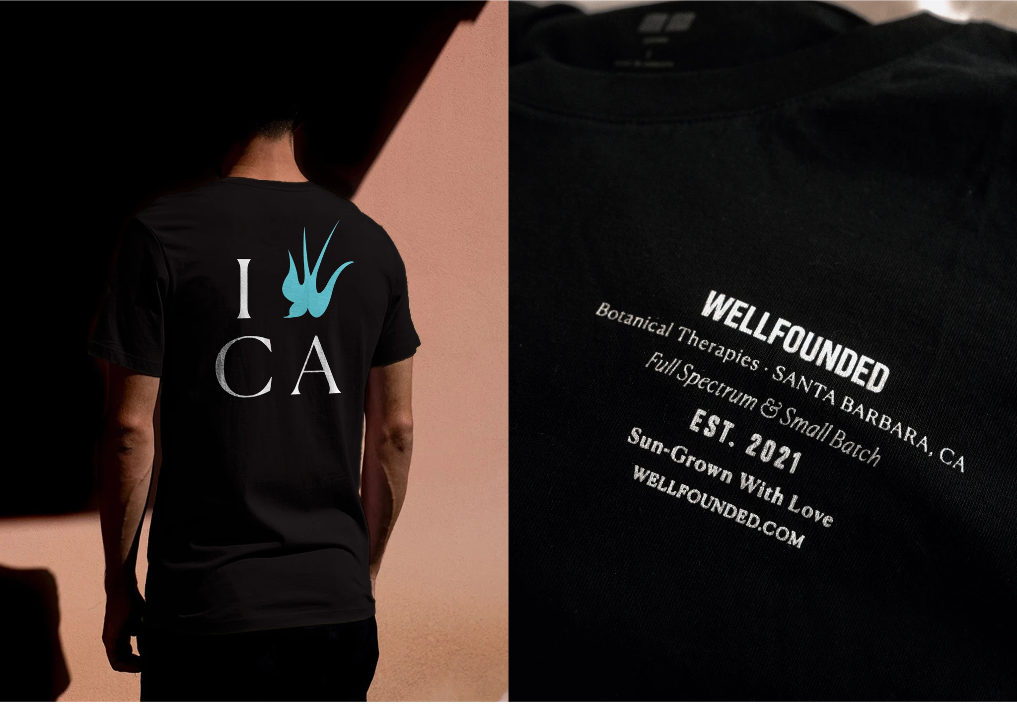
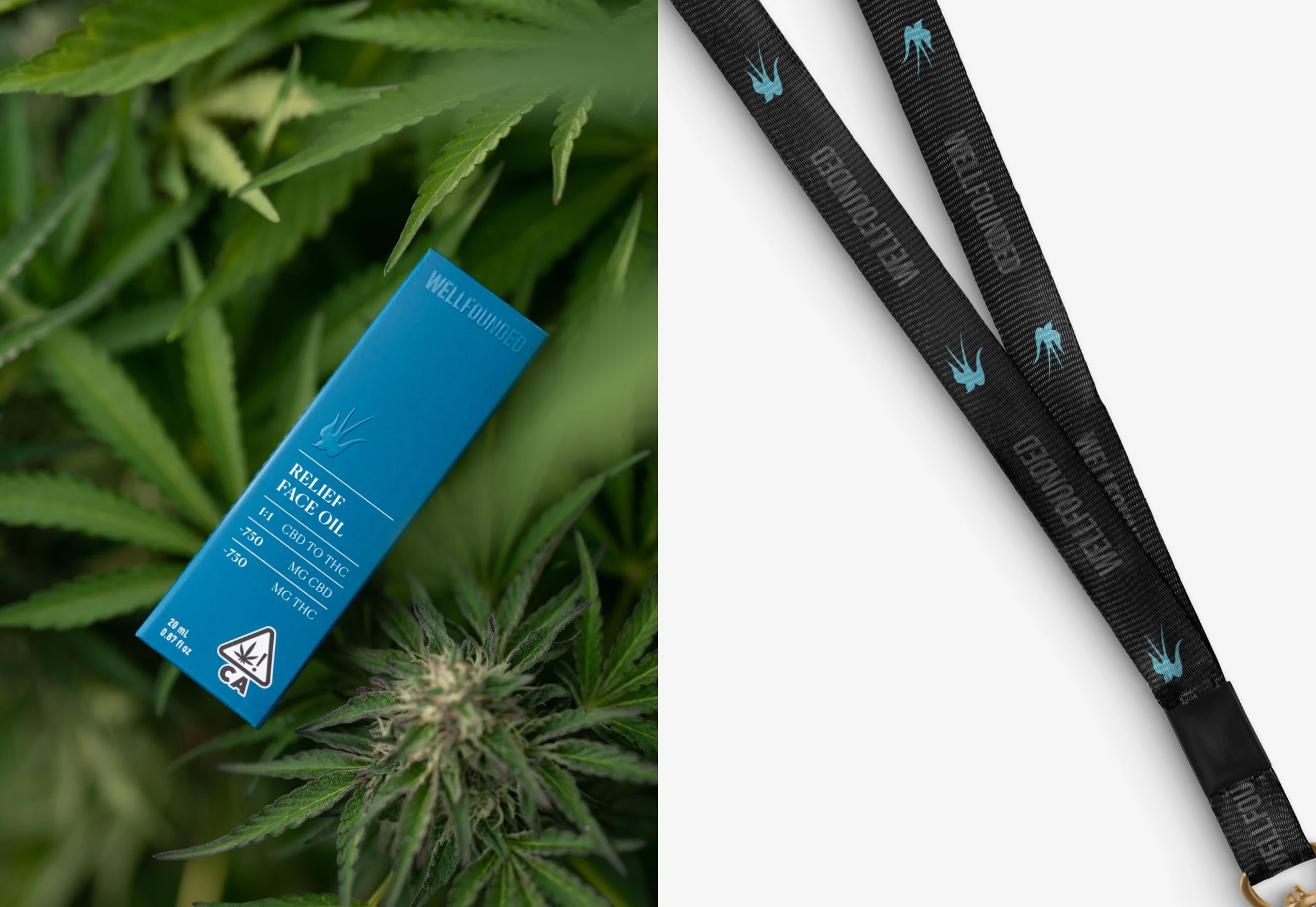
We built the identity around clarity and potency—everything had to feel intentional, effective, and unfiltered. The visual system uses a three-blue coding across SKUs where color directly maps to formula strength: light blue for CBD-heavy, medium for balanced, dark for THC-forward. No guesswork at the dispensary. Typography mixes serif and sans serif for productive tension—serif carries the smart, clean brand voice while condensed sans handles ingredients and regulatory copy.

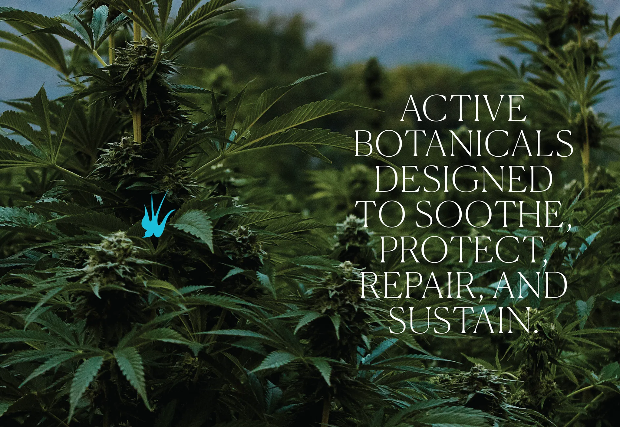


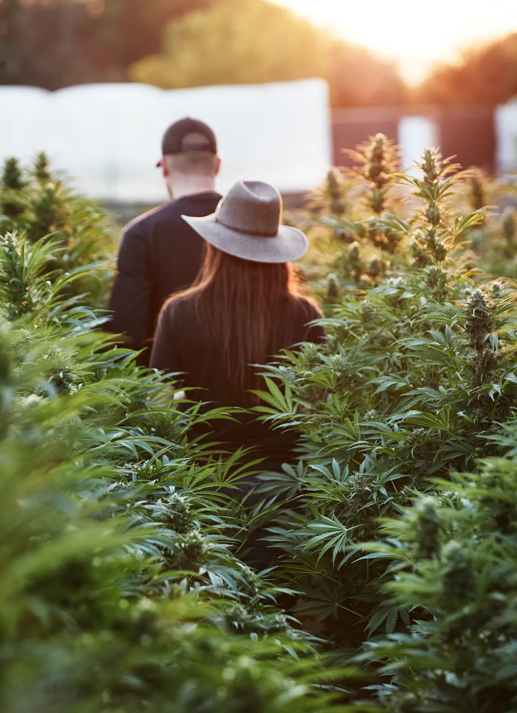
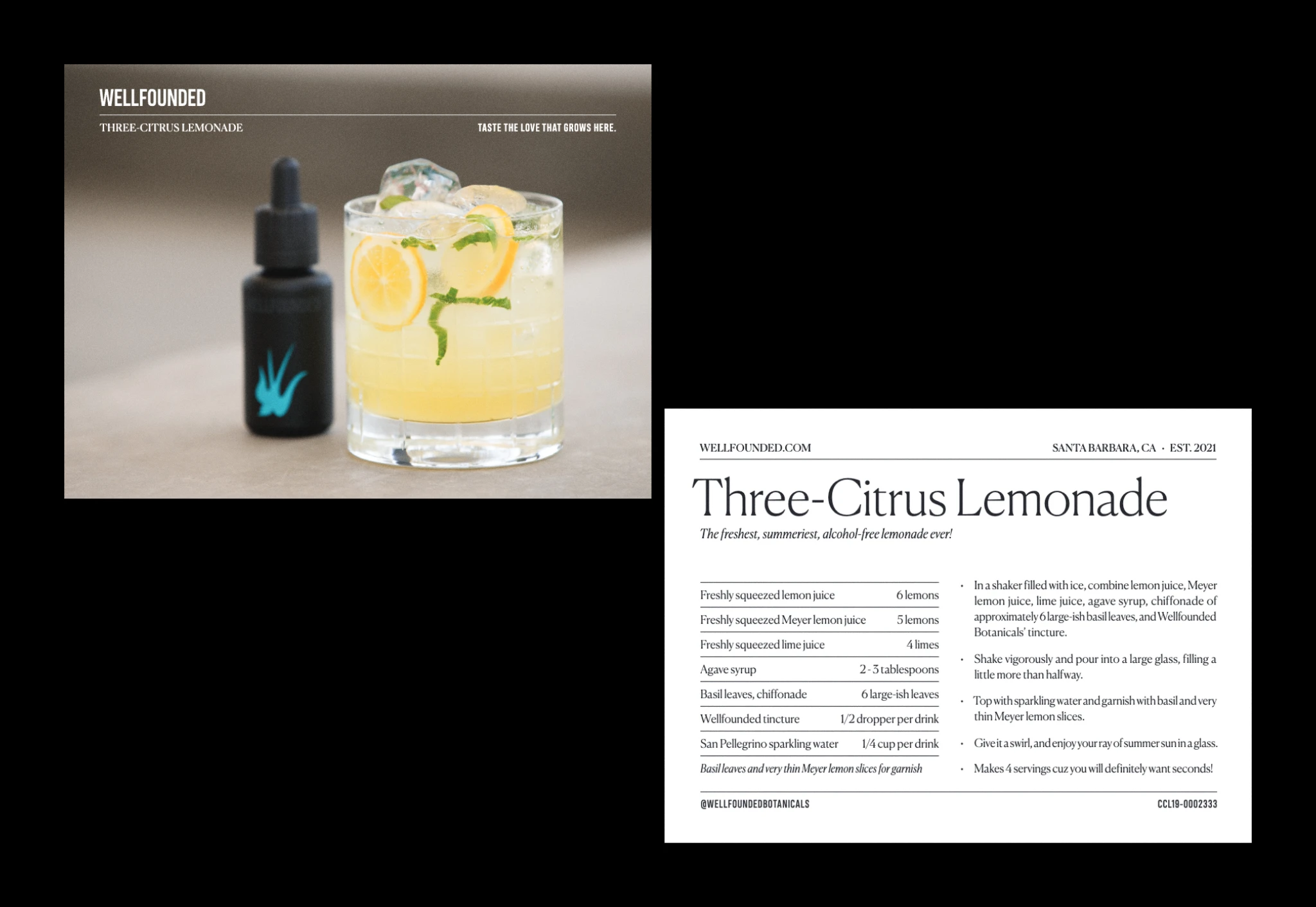
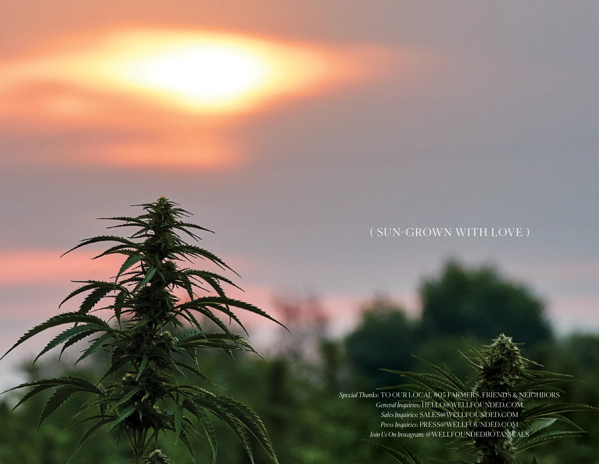
Brand imagery brings contrast through warm, sensory, farm-forward photography that keeps everything grounded in where the product actually comes from.
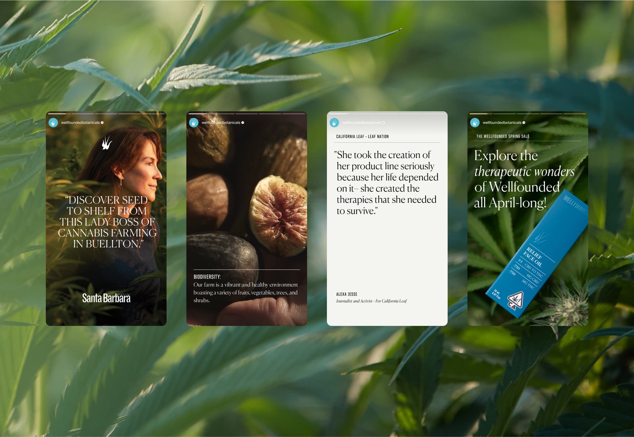


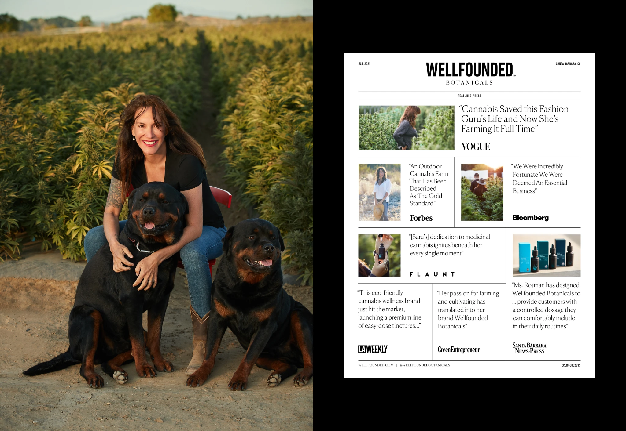
Working as part of a small team, I was deep in the weeds on everything: brand identity, packaging, web design, content creation, photoshoot prep, production, copywriting, press kits, sales sheets—even invoices and product retouching. It was one of those rare projects where the creative work was both big-picture and incredibly hands-on. The brand launched to immediate recognition in Forbes, Vogue, Bloomberg, and Benzinga, proving that cannabis consumers were ready for something that didn't look like a head shop.
credits
AgencyNEWCo Branding
RoleDesign Director
CCOSara Rotman
EVPKimberly Brower
Photography / VideoBrian Bins, Blake Bronstad, Heather Gildroy